Friday, 9 April 2010
Message from Ms Prince
Your blog has now been marked for research and planning. Anything further added to your blog will not be counted towards your overall mark.
Tuesday, 6 April 2010

Final Main Article
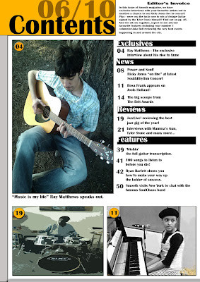
 I decided to go with a simplistic article background straight off the bat when I took this picture. The picture is of my main artist in the park playing the guitar. It makes him look natural. The clothes he is wearing look casual suggesting he's like everyone else, not a celebrity but just a normal person giving the reader a sense of approachability. The text itself is in size 11 in the font Britannic Bold which is the same font I've used for everything else which keeps everything consistant and not confuse the reader.
Making the main artist the centre of the page makes him the most important thing and it draws the readers eyes towards him.
The floating quote was added to have audiences easily relate to him because they may feel that music is their life too.
The title of the article is called "Strings, Strum and Soul." the alliteration instantly hooks the readers making it easily memorable. Strings standing for the strings of the guitar, Strum standing for the actual playing of the guitar, and Soul for the actually genre he plays or it could be that playing his music affects him spirtually.
The actual font has a black outline around it so it doesn't melt to the background and look tacky.
The questions are in subheadings which are above every answer to section each text. I felt it was important to use the right register so my audience don't become to overwhelmed with everything on the page. I had to keep it simple and sophisticated and I believe I've done this with the black shadowing around the text. When writing the article I had to make sure I wasn't using slang or colloquialisms because my target audience are of a matue age range so it is mostly all in standard english with some exceptions because I'm still trying to target younger people too.
Preliminary Task
 This is the front cover for my preliminary task. The task was to design a magazine front cover and contents page for our school - a school magazine. The one thing I wanted to keep consistant in my magazines was the colour scheme. My scheme was yellow(gold), black and white. These colours are simple and I think the gold stands out making the magazine appealing. The black background looks sophisticated so I decided to add a a yellow pattern to the back of the main image to make it more snazzy and funky for the readers as my target audience are secondary school students who prefer colour and pictures to long pieces of text.
My main image is a picture of myself. I didn't bother about the main image to much though I believe I should chosen a better costume as the blue and yellow colour scheme don't really go together. However using a student as the main image was a way to appeal to my audience as they could relate to the student because he is like them.
I made the majority of my text big and easy to read because my target audience are young and want things to catch thier attention. My cell lines included subjects that would appeal to the reader because they would easily be able to relate to it - e.g. Lockers or the school canteen.
The Masthead is big and chunky making it almost a masculine targeted magazine. The silver to black was a really effective technique because I think these colours are strong, bold and silver connotes slick and stylish attitude and most of the students in this school want to be like that.

The contents page is a little different as I didn't include a picture. I didn't include a picture because I wanted to appeal to not only years 7-11 but 6th formers too. 6th formers are still part of this school and don't want to bombared with all these pictures. Having no pictures makes it seem sophisticated so in a way it is subverting the stereotype.
I added a few effects to the text to make it stand out from the black background (e.g. Drop Shadow, Inner Glow, Outer Glow, Gradient Tool).
Monday, 5 April 2010
Audience Feedback
Audience Feedback
Front Cover
Good:
Bad:
Contents Page
Good:
Bad:
Main Article
Good:
Bad:
Front Cover
Good:
Bad:
Contents Page
Good:
Bad:
Main Article
Good:
Bad:
Friday, 26 March 2010
Evaluation
1. In what ways does your media product use, develop or challenge forms and conventions of real media products?
2. How does your media product represent particluar social groups?
3. What kind of media institution might distribute your media product and why?
While looking for publishers we stumbled upon the Guardian Media Group. This publisher seemed perfect for the publication of our magazine because of the similarities with what they already publish. GMG work on the radio stations like Smooth Radio/ Jazz FM and they also publish the newspaper The Guardian. These are the exact type of mediums my audience would read and listen to as The Guardian is a fairly mature newspaper and my target audience are mature. Smooth and Jazz Radio offer easy listening music which my magazine offer also. Therefore this would be publisher for my magazine as they already have the experience and is successful in delivering for the niche population. My audience would find easy to make the link the successfullness of Smooth Radio and such and think my magazine was just as good because of GMG's amazing publishing.
4. Who would be the audience for your media project? Our Readers enjoy:
Listening to radio stations like Smooth Radio or Heart 106.2 or even Magic 105.4 because I believe these stations offer cool, smooth, niche music which my auidence appreciate.
My audience also like to collect lots of records and CD's of their favourite artists and prefer to listen to 80's or 90's making them feel nostalgic.
Style of Audience
My audience are aspirers as well as indiviualists as they want to not only listen to music but take an active roll in the making of their own music. They are passionate about playing an instrument and truely apreciate music being their most loved hobby.
My audience are a very stylish audience as well with fashion being their many loves. What they wear when they play an instrument is as showcase for who they are.
They like to apreciate the classic musicians like Barry White, Marvin Gaye or Teddy Pendagrass.
Finally, my audience are define as indiviualists as they don't just go along with the crowd and listen to mainstream music.
Characteristics of Audience
- Middle-Class
- Prefer broadsheet newspapers to tabloids e.g. The Guardian as oppose to The Sun
- Appreciate the finer music
- Are musicians themselves
- Use the internet
- Age 25+
- The audience has a mixture of males and females
5. How did you attract/address your audience?
Conventions
View more presentations from Kero00.
2. How does your media product represent particluar social groups?
Representation
View more presentations from Kero00.
3. What kind of media institution might distribute your media product and why?

While looking for publishers we stumbled upon the Guardian Media Group. This publisher seemed perfect for the publication of our magazine because of the similarities with what they already publish. GMG work on the radio stations like Smooth Radio/ Jazz FM and they also publish the newspaper The Guardian. These are the exact type of mediums my audience would read and listen to as The Guardian is a fairly mature newspaper and my target audience are mature. Smooth and Jazz Radio offer easy listening music which my magazine offer also. Therefore this would be publisher for my magazine as they already have the experience and is successful in delivering for the niche population. My audience would find easy to make the link the successfullness of Smooth Radio and such and think my magazine was just as good because of GMG's amazing publishing.
4. Who would be the audience for your media project?
 Our Readers enjoy:
Listening to radio stations like Smooth Radio or Heart 106.2 or even Magic 105.4 because I believe these stations offer cool, smooth, niche music which my auidence appreciate.
My audience also like to collect lots of records and CD's of their favourite artists and prefer to listen to 80's or 90's making them feel nostalgic.
Style of Audience
My audience are aspirers as well as indiviualists as they want to not only listen to music but take an active roll in the making of their own music. They are passionate about playing an instrument and truely apreciate music being their most loved hobby.
My audience are a very stylish audience as well with fashion being their many loves. What they wear when they play an instrument is as showcase for who they are.
They like to apreciate the classic musicians like Barry White, Marvin Gaye or Teddy Pendagrass.
Finally, my audience are define as indiviualists as they don't just go along with the crowd and listen to mainstream music.
Characteristics of Audience
- Middle-Class
- Prefer broadsheet newspapers to tabloids e.g. The Guardian as oppose to The Sun
- Appreciate the finer music
- Are musicians themselves
- Use the internet
- Age 25+
- The audience has a mixture of males and females
5. How did you attract/address your audience?
Attracting My Audience
6. What new technologies have you learnt in the process of constructing the product? View more presentations from Kero00.
Media Technologies
7. Looking back at your preliminary task, what do you feel you have learnt in the progression from it to the full product? View more presentations from Kero00.
Progression
View more presentations from Kero00.
Subscribe to:
Posts (Atom)